
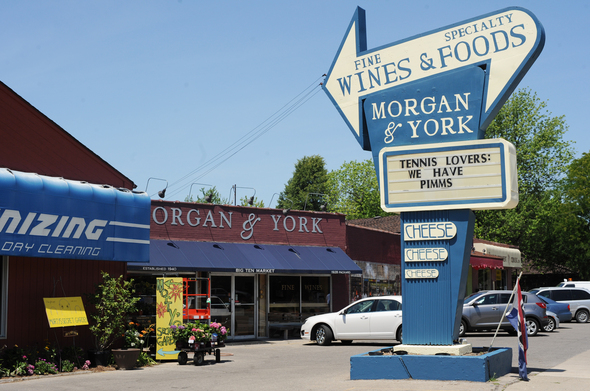
New look for Ann Arbor icon: Morgan & York owners repair and re-paint landmark Ann Arbor sign
Melanie Maxwell | AnnArbor.com
According to the owners, the original sign - one of the most distinctive in the city for decades - was rusting through and the neon was falling apart, creating unsafe conditions on windy days.
“The I-beams that hold the sign up were being compromised,” co-owner Tom York said. “We patched the top up, and then the neon was so old that it would fall off when it got windy and you would have one or two feet pieces of glass flying around.”
The history of the sign is straightforward: When the Big Ten Market opened in 1940, there was a simple large trapezoid erected to entice passers by to check out the family grocery store at 1928 Packard.
Then when Eugene Towner and Edward Sharon bought the store in 1953, Sharon used his Lansing connections to get a liquor license. To advertise the addition, a large arrow with “LIQUOR” written in neon was added to the sign and an Ann Arbor landmark was born.
But today's zoning regulations ensure that the sign cannot be replicated.
That's led to the landmark also finding itself in controversy. In 2005, Big Ten Party store co-owner Matthew Morgan wrote an open letter to customers in which he revealed that the City of Ann Arbor had been pressuring the owners to take down the sign “for years” and another attempt was in the works.
Morgan and co-owner Tom York appealed the city's initial ruling that they would have to tear down the sign and replace it with a seven-foot miniature version. They were successful, and landmark sign still stands at its original height of 25 feet.
That history means the most recent work wasn't done without consideration.
York said the sign was no longer viable in its current state because there was a big hole in the top where it had rusted through and there was water leaking down throughout the sign.
York and Morgan bought the store in 2001 and changed the name to Morgan & York in 2006. Morgan said neighbors have been complimenting them on the re-done sign.
“People seem to like it. There haven’t been any negative reactions we’ve heard,” he said. “Some people are confused because they think the sign used to say ‘Big Ten Party,’ but it never did.”
Leisa Thompson | Ann Arbor News
“The plan was to preserve the original neon, but the lowest estimate we got was $38,000,” he said. “The contractors were all hesitant to work on it because of the rust on the interior I-beams.”
Garrett Scott runs an antique book store and sublets from Morgan and York. He said the new sign is better than having the old one torn down.
“It’s a big part of how I tell people where I’m located when they come to find me,” he said. “Without the sign we’re just another strip mall.”
York said the long-term play is still to restore the neon, but for now Ann Arbor will have to get used to the new blue, white, and safe sign.
Ben Freed covers business for AnnArbor.com. Reach him at 734-623-2528 or email him at benfreed@annarbor.com. Follow him on twitter @BFreedinA2
Comments
Goofus
Sat, Jul 7, 2012 : 3:47 a.m.
Did they use Comic Sans for that font? Must be the joke is on the consumer with these high prices...
annarborjohn
Fri, Jul 6, 2012 : 5:14 p.m.
Henry Charron, my father, not Edward Sharon was Gene Towner's partner in the Big Ten Party Store and I liked the old sign
P. J. Murphy
Fri, Jul 6, 2012 : 3:16 p.m.
Morgan and York is everything a specialty food store should be. Excellent quality across a range of food and beverages and the most knowledgeable and friendly staff anywhere. I was a long time customer of Big Ten, and honestly was a little skeptical at the transition, but the more I visited the store the more I was positively impressed. By the time it closed B10 was way behind the curve, but Morgan and York has carried on the tradition of quality food in a convenient location. The sign is a legitimate neighborhood landmark, no matter what city officials may think. I wish they'd come up with a more graphically appealing solution, but I'm glad they are not allowing it to deteriorate further.
Goofus
Fri, Jul 6, 2012 : 3:34 a.m.
Now if they could just repair their absurdly high prices and outrageous overhead. I'm amazed this place makes any money at all....it seems alot of times like a money-losing hobby of the ownership...
Tom Drake
Thu, Jul 5, 2012 : 9:35 p.m.
looks terrible, washed out colors and bad fonts. why not tear it down and spare us another eyesore. you could lose the stupid long coats too.
Brad
Fri, Jul 6, 2012 : 12:42 p.m.
Evidently they are still pretty touchy about those coats ...
Madeleine Borthwick
Thu, Jul 5, 2012 : 7:51 p.m.
Hey, as long as it has the "cheese-cheese-cheese" on the sign I'm happy. I'm hoping they have the great selection of cheese-cheese-cheese also!
ArgoC
Thu, Jul 5, 2012 : 5:19 p.m.
I'm very glad to see it preserved, even if it has a more sedate look. Someday, somebody with more "neon" tastes may take over the store and bring back the funk, and the sign will be ready.
Atticus F.
Thu, Jul 5, 2012 : 3:55 p.m.
I hope they are reffering to the Big Ten sign as an Ann Arbor icon, and not Morgan and York! I went into Morgan and York. Once. And when I saw they were trying to charge $12 for a bottle of margarita mix, which was availible at the local corner store for $3.98 (same brand/same bottle), I never went back. Morgan and York; definitely not an Ann Arbor icon.
Ypsi Russell
Mon, Jul 16, 2012 : 8:08 p.m.
I appreciate being able to step into a liquor store without facing a gauntlet of thugs and loafers in the parking lot, or waiting for my turn in a place that also sells cigarettes, lottery tickets, K-2, pornography, K-Y, and diapers. The pleasant experience is worth some extra dough to M & Y's clientele.
jwally
Thu, Jul 5, 2012 : 9:19 p.m.
Twinkies only diet? Might work for you in the long run. If you ever get in trouble with the law, you can use the infamous "Twinkie Defense".
Dr. Libert
Thu, Jul 5, 2012 : 8:42 p.m.
It's a plot. I only eat twinkies. That I make myself.
Atticus F.
Thu, Jul 5, 2012 : 7:35 p.m.
I think the owners are a couple of ex-Zingerman cronies, or are somehow related to Zingermans.
dougfair
Thu, Jul 5, 2012 : 6:53 p.m.
Isn't that the same pricing model used by Zingerman's? Nope, I don't shop there either for the same reason.
Britain W.
Thu, Jul 5, 2012 : 3:53 p.m.
I daresay it still looks better than the signs on Strickland Market on Geddes. They took the neon out, underlit from within, with red lenses.
InsideTheHall
Thu, Jul 5, 2012 : 3:36 p.m.
Did the Historical and Planning Commissions approve of this? Oh, that's right, if you are part of the berkenstock click those rules don't apply. Many of us miss the Big Ten Party Store and all it stood for. Great prices, value wines, and knowledgable staff.
Giacomo Senna
Thu, Jul 5, 2012 : 10:09 p.m.
Morgan & York has all three things you mention, there are many good wines in the $12 - $15 range and the staff absolutely has the knowledge to help you find what you're looking for regardless of the price point in my experience. I've bought $8 bottles and $80 bottles and been happy with both. I don't get the sense that the proprietors of this store are members of the "Birkenstock clique" and I guess it's a safe bet you aren't either since you misspelled both words.
Dr. Libert
Thu, Jul 5, 2012 : 8:41 p.m.
Me too. Berkenstocklick. Heh-heh-heh-heh
Watcher
Thu, Jul 5, 2012 : 3:07 p.m.
That is a seriously ugly sign. It doesn't come close to meeting the City's sign ordinance standards. But it survives as a preexisting use.
Tom Drake
Fri, Jul 6, 2012 : 3:06 a.m.
it survives because they couldn't afford to have it removed. it was not saved by public acclaim , it was saved by lack of funds. now its really ugly .
Jim Walker
Thu, Jul 5, 2012 : 2:36 p.m.
I am glad they finally did the repair/restoration work, per their petition and promise of several years ago. The sign IS a landmark of the neighborhood. James C. Walker, Ann Arbor.
Some Guy in 734
Thu, Jul 5, 2012 : 2:11 p.m.
Am I really the lone dissenter? Morgan & Yecch, more like. What was once a lovely example of space-age glitz now looks like a bored teenager's binder doodle. The blue-white palette doesn't help matters. I can almost smell the Biro ink. The lettering is particularly odious. The top half used to seem so sure of itself; the "CHEESE CHEESE CHEESE" had a real exuberance to it. What's left feels at once both overly deliberate and clumsy.
Tom Drake
Thu, Jul 5, 2012 : 10:55 p.m.
no you are not alone, you are spot on.
fjord
Thu, Jul 5, 2012 : 6:11 p.m.
I'm glad they're doing what they can to preserve the sign, but I agree that the lettering and color palette leave much to be desired. The lettering on the arrow just looks amateurish. It would look better with letters cut from wood or metal attached to the sign, rather than letters simply painted onto the surface. As for colors ... there are perfectly good shades of blue and gold ... er, maize ... firmly established all over this town. Seems like a no-brainer to me.
Eric J. Klooster
Thu, Jul 5, 2012 : 3:57 p.m.
The lettering in the arrow portion of the sign is really sloppy and inconsistent. If they could just redo that with a little more planning the whole thing would look much better.
MIKE
Thu, Jul 5, 2012 : 3:06 p.m.
I'm with you. It used to be a special, really fun looking piece of art. Now it's just a billboard.
Brad
Thu, Jul 5, 2012 : 2:22 p.m.
Just get rid of the sign. It belonged to Big Ten Party Store, and M&Y is pretty far from what that was. Say - are they still wearing those funny coats there?
Linda Peck
Thu, Jul 5, 2012 : 2:04 p.m.
Thankfully, a landmark has been saved! We old timers love seeing things stay somewhat the same.
Dog Guy
Thu, Jul 5, 2012 : 1:21 p.m.
This arrow sign shape could be used to designate the Guy Larcom City Hall, which was stripped of its sign when a utility shed was built next to it. The tilted signpost near the Huron St. curb has never had a sign installed, which is amazing considering the recent frenzy of official signage downtown. Is someone planning to change the name of this building?
jgold47
Thu, Jul 5, 2012 : 12:50 p.m.
I cant imagine how much grease it took to get the PRA to approve that non-conforming sign. These cities are on a rampage to remove these iconic beacons by forcing owners into bland monument signs. the logic is typical, M & Y could have left the sign up, in disrepair in perpetuity, or they could have cleaned up the sign and made it look nice again. However, that would trigger compliance, and the sign would be non-conforming and have to come down. So your choices are nasty old sign, or take it down. Thankfully M & Y got lucky and got a variance, however, a lot of other property owners have not been so lucky.
2WheelsGood
Thu, Jul 5, 2012 : 12:36 p.m.
As a close neighbor and a frequent shopper, I think the sign looks great! Thanks for being part of our neighborhood!
justcurious
Thu, Jul 5, 2012 : 12:32 p.m.
Must be a slow news day. I liked Big Ten, but this article about the old sign being renovated is silly.
anonymous
Thu, Jul 5, 2012 : 2:06 p.m.
Good Grief Charlie Brown - you have to dig pretty deep to create a negative point of view. Great job Morgan and York!
jgold47
Thu, Jul 5, 2012 : 12:52 p.m.
Ron/Cash - the real story (although A2.com did their usually poor job highlighting it) is that they were able to keep and refurbish their non-conforming sign. For commercial property owners throughout the area/country, this is a big deal.
Cash
Thu, Jul 5, 2012 : 12:40 p.m.
I'm with you on this one, JC. Come on...store replaces sign grabs today's headlines? I just burst out laughing when I clicked here and saw this as the lead story.
Ron Granger
Thu, Jul 5, 2012 : 12:39 p.m.
Not as silly as reading it and commenting on it. It may not be obvious, but this is a big ten football town. The sign was a "big ten" landmark in the town. Much like Beer Depot's sign. There is some history, as Big Ten carried a great beer selection when most stores in town did not.
Wolf's Bane
Thu, Jul 5, 2012 : 12:20 p.m.
What a great solution! Congratulations on a job well done! How would you guys like to run for city council?
Blue Marker
Thu, Jul 5, 2012 : 11:54 a.m.
My favorite part of the sign? "Cheese, Cheese, Cheese".
Madeleine Borthwick
Thu, Jul 5, 2012 : 7:53 p.m.
Blue Marker, TOO RIGHT! I love the cheese-cheese-cheese!
Laiane
Thu, Jul 5, 2012 : 4:27 p.m.
Mine, too. I think I drive my husband crazy because I say "cheese Cheese CHEESE" every time we drive by.
Robo
Thu, Jul 5, 2012 : 11:26 a.m.
Only a little disappointed there is no neon. Looks great though.
Mary Bilyeu
Thu, Jul 5, 2012 : 10:16 a.m.
The sign looks great! :)