
Ann Arbor Art Center presents a thought-provoking exploration of 'Print'
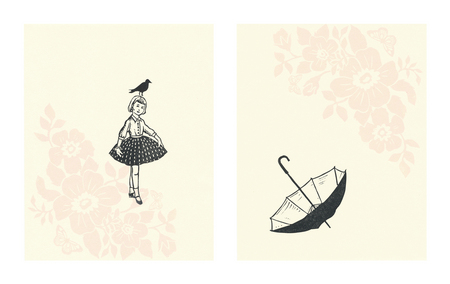
"Adolescence" by Kathleen Laufman.
“I think my difficulty to explain comes from the rather ‘curious’ nature of juried exhibitions,” continues Bolton, head of the Print Media Department and artist in residence at Bloomfield Hills' Cranbrook Academy of Art. “Let me try to explain myself: Juried shows, from my experience, are wonderfully strange creatures. They are neither this, nor that—they are something curious and in-between.”
It’s clear from the results of this 29th edition of “The Print” that Bolton was looking for his “something curious and in-between”—and he’s certainly found it.
As he concludes, “I have selected the very broadest possible range of work in terms of style, media, and subject matter. Here’s a short list of words (or categories) that describe the kinds of prints, processes, and subject matter on view: flora and fauna prints, landscapes (representational and abstract), dreamscapes, decorative abstractions, formal abstractions, figurative prints, illustrational prints, social commentary, narrative prints, image/text prints, relief prints, screen prints, digital prints, lithographs, intaglio prints, mixed media prints, collage prints, artist book prints, and experimental prints.”
This wide-open approach is one of the two hallmarks of this year’s “The Print.” The second lies in Bolton's choices for distinction.
Rather than judge single pieces, Bolton’s focused on bodies of work. As such, each of the artists chosen for distinction is represented by two or more works whose integration crafts a superior whole.
Bolton’s choices for this year’s Janet Gallup Memorial Award (Best of Show) are Bruce Thayer’s collograph and intaglio “The Bully Market” and collograph, intaglio, and relief “The Goods.” Second place went to Cindi Ford’s 50-piece etching and wax “Artifacts Overlooked” and her 16 red-tinged reduction woodcut, etching, terography, and wax “What Happened to the Narrative.” Third place went to Kathleen Laufman’s linoleum print “Fragile” and “Adolescence” diptychs. And honorable mentions were handed to Lee Ann Frame’s multiple-color plate etching diptych “The Adventures of Friendship” and Ladislav Hanka’s bronze etching diptych “Kalamazoo River Songline.”
This is a “big print show,” says Bolton of his selections, “where you will see an enormous range of work that represents a kind of big family gathering of print artists and their work from the perspective of this particular moment and place in time.”
And so it is. There are 53 works on display by 45 Michigan talents. Among noteworthy local and regional printmakers are Joseph Bergman, Mary Hatch, Michelle Hegyi, Judith Jacobs, Christy Kelly-Bentgen, Kathyn Luchs, Vickie Peterson Michalak, and Elijah VanBenschoten; as well as prize-winners, Ford and Thayer.
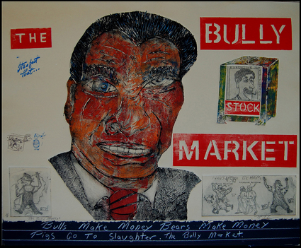
"The Bully Market" by Bruce Thayer.
Thayer’s tosses in as much sharp-edged commentary as possible, and he’s not inhibited about his partisanship. Saying what he means is paramount.
Yet saying what you mean as a visual artist isn’t quite the same thing as it is for other commentators. For one thing, there’s a consistent element of dark humor in his prints enlivening the compositions. And for another, there are observations that are off-handedly vague even as the print’s whole is clearly opinionated. That means there’s a lot to puzzle over as well as admire in Thayer’s aesthetic whether or not you accept his viewpoint.
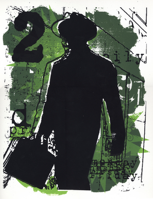
“Ritual” by Tim Gralewski.
A noir screen-print whose careful composition is as indebted to graphic design as it is a sort of commentary, “Ritual” presents the silhouette of a businessman swinging a briefcase while he stands next to an oversized industrial-strength numeral 2. Receding diagonal lines give the impression of an urban backdrop with additional typography giving the work the feel of a poster. Likewise, Gralewski’s use of background greens abetted by Pop Art force lines animate the work.
Gralewski’s “Ritual” is seemingly private—although there are enough social issues in the work’s composition to make it otherwise. So while his print doesn’t especially espouse a cause; its subject matter is enough to warrant such consideration. It’s a superior blend of sly commentary posing as fine art.
“The Print 2011” will continue through June 26 at the Ann Arbor Art Center, 117 W. Liberty St. Gallery hours are 10 a.m. to 8 p.m., Monday-Friday; 10 a.m. to 6 p.m., Saturday; and noon to 5:30 p.m., Sunday. For information, call 734-994-8004.