
Posted on Fri, Jun 10, 2011 : 8:37 p.m.
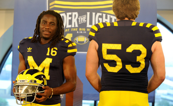
What do you think of Michigan's legacy uniforms?
By AnnArbor.com Staff
Angela J. Cesere | AnnArbor.com
Denard Robinson says he loves the stripes. Ryan Van Bergen likes the numbers on the helmets. Now, we ask you:
Comments
Blu-dogg97
Mon, Jun 13, 2011 : 8:14 p.m.
Both ND & UM are wearing throw back jersey's for one game! The players seem to like them! Non issue guys.. Now lets play football... GO BLUE...
paperstreetsoap
Sun, Jun 12, 2011 : 2:19 p.m.
Can anyone tell me when if ever the football uniform had stripes on it? I believe I read an article about how it was never the case. So are we borrowing them from the hockey uni? If so then maybe we could also get the little pieces of fabric that hold the women's v-ball sleeves up? That would look sweet! NOT! Overall the uni's are not good and putting the number on the helmet? bad bad bad
Shafer
Sun, Jun 12, 2011 : 12:24 a.m.
These are but ugly uniforms. I really don't care if they are like the unis from back in the day, they should leave them back in the day. Nike would have came up with a better idea, addidas sucks.
aareader
Sat, Jun 11, 2011 : 6:59 p.m.
yawn. Just play football in the current uniforms
D21
Sat, Jun 11, 2011 : 3:15 p.m.
Is Brandon auditioning to become the next fashion designer instead of doing the AD job he was hired to do? Yep! Totally UnMichigan of him to do that. P.S. It would be okay if these uni's were caked with real mud from the field at Big House.
dotdash
Sat, Jun 11, 2011 : 2:51 p.m.
In general, I don't really care what they wear; it's how they play. That said, AA.com asked, so here's what I think: The conceit of a football jersey is that the man inside is actually that shape -- big shoulders, powerful chest. That's part of the intimidation of seeing someone wearing a football uniform. These uniforms make it clear that the shoulders are pads, not man. You can see them sitting right on top of #53's shoulders. So I say they fail, not because of the stitching but because they work against the central idea of the football jersey.
daytona084
Sat, Jun 11, 2011 : 1:43 p.m.
Another sign that Michigan is losing it's understated class and becoming just another cookie cutter major college when it comes to football. Traditions are slowly disappearing... now we have night games, throwback jerseys, suites, blasting rock music, big electronic scoreboard. I won't be surprised to see tacky rah-rah cheer leading on the scoreboards and lots of advertising.
aareader
Sat, Jun 11, 2011 : 7:01 p.m.
could not have stated it better myself
Gordon
Sat, Jun 11, 2011 : 1:12 p.m.
Everybody takes on a new job and puts their stamp on it. This is what this appears to be though it must have been started sometime ago. U of M makes out but why change uniforms when tuition continues to outpace inflation? As stated: "it doesn't improve performance". Just seems like an un-necessary change about nothing when the economy is slow. These little changes don't improve the publics attitude about the cost of college nor does it improve the team. Seems to me a poor decision when there are so many other issues that need to be addressed.
tater
Sat, Jun 11, 2011 : 12:39 p.m.
As HL Mencken is often quoted as saying, "No one ever went broke underestimating the intelligence of the American public." This is a brilliant marketing ploy, though: disguising a money-grab as "tradition." I guess Brandon is showing the true definition of the "transparency" he expects from his staff. What's Brandon's next insult to the collective intellect of Michigan fans? A maize and blue field? That will firmly put Michigan in a class with great schools like Eastern Washington University? Even though I am about half-kidding here, I am convinced that Brandon wants to sell advertising along the inner walls on the field, too, making the Big House look like a big minor league baseball park. I hope he leaves to run for office soon before he does any more damage to what he calls "tradition."
GoBlue1996
Sat, Jun 11, 2011 : 12:29 p.m.
I would like to see throw back style socks with Adidas stripes or checkered, along with black shoes with Adidas maize stripes. Same with the pants. Add the same pattern as the shoulders of the jersey to the sides of the pant thighs. Can you give Denard glow-in-the-dark shoelaces?
braggslaw
Sat, Jun 11, 2011 : 12:08 p.m.
I'm sorry those lines are awful.
clarklaker
Sat, Jun 11, 2011 : 11:48 a.m.
I am not a big fan of the uniforms. Besides at night and Denard going by at light speed they will be a blur anyway.
Macabre Sunset
Sat, Jun 11, 2011 : 6:49 a.m.
I realize this stuff is a cash cow for the University, probably will pay for at least one minor sport for the entire season solely from the proceeds from this jersey. As long as it's maize and blue, I'm OK with it. It's worth a laugh or two, and the players seem to get a charge out of it.
Tru2Blu76
Sat, Jun 11, 2011 : 6:03 a.m.
Outrageous uniforms?? -- Just look at what Oregon gets away with! LOL! Someone at Adidas is a design genius: only a genius would think to provide the possibility of quick and easy fake (hand in armpit) farts. Imagine our offense hunkering down for the attack but suddenly every lineman squirts off a quick fake fart. THEN they ball is snapped to Denard and the Wolverines run rampant over the helplessly laughing Notre Damned defense.
snoopdog
Sat, Jun 11, 2011 : 4:48 a.m.
They would pretty good with a leather helmet and no face guard. You gotta be kidding me, you think changing clothes is going to turn this team into winners ? Good Day
Shafer
Sun, Jun 12, 2011 : 12:27 a.m.
Whos your team poopdog?
ThoseWhoStayUofM
Sat, Jun 11, 2011 : 2:26 a.m.
The adidas logo is there because it has to be.... adidas is supplying the funding and designing them for us. The stitching looks good and it is a reproduction of how they used to stitch the logo on jerseys when they were made out of wool. The stripes look EXCELENT despite all the haters that judged them before they saw the ACTUAL jersey when it was ACTUALLY warn by players. Like I said before, the striped shoulders would look amazing without the sleeves (that were in the pirated pic). These uniforms look (dare I say) better than the standard ones. The stripes compliment the terrific Michigan winged helm and I even love the number on the side of the helmet. 5 out of 5 and all the haters are just old hoagies that are afraid of any and all change.
snoopdog
Sat, Jun 11, 2011 : 4:53 a.m.
whatever kool aid you are drinking , I want some. Good Day
dading dont delete me bro
Sat, Jun 11, 2011 : 2:15 a.m.
david, those lines are from back in the day when that block m was stitched like that to stay on. i don't think adidas was around in the 1890's either...
David Briegel
Sat, Jun 11, 2011 : 1:40 a.m.
How do you take that beautiful Maize block M and put those silly, stupid lines through it? Why? What purpose? What were you thinking? And that ridiculous Addidas logo.?
5twentytwo
Sat, Jun 11, 2011 : 1:36 p.m.
@dog So by your reasoning, if Mcdonald's pays the school a couple of hundred grand a year too, you'll be ok with Michigan replacing the block "M" with a McDonald's "M"?
snoopdog
Sat, Jun 11, 2011 : 4:51 a.m.
That ridiculous logo pays your stupid university a couple hundred grand a year or more to display that. Good Day