
Ann Arbor's new Justice Center: One of the ugliest buildings in America?
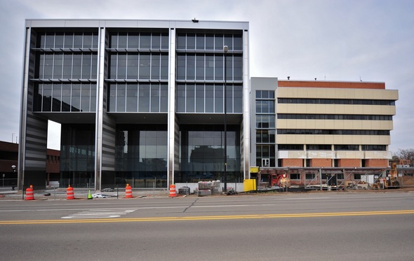
The new Ann Arbor Justice Center is on the left, while the original Guy C. Larcom Building, is on the right.
Ryan J. Stanton | AnnArbor.com
Beauty, as they say, is in the eye of the beholder. The same could be said for ugliness. Someone apparently thinks the new Ann Arbor Justice Center is among the ugliest buildings in America.
A photo of the building has shown up on the website Fark.com, a news aggregation and social networking site with attitude, in a discussion thread about the country's ugliest buildings. Fark readers who have accounts on the site can vote for their favorites in a list of buildings.
Among other municipal buildings mentioned in the thread are the Tempe, Ariz., and Dallas city halls. Someone also nominated the entire campus of Oral Roberts University in Tulsa, Okla.
The recently completed Justice Center at the corner of East Huron Street and Fifth Avenue is the new home for police and courts in Ann Arbor. It forms the Ann Arbor Municipal Center along with the original city hall, the Guy C. Larcom Municipal Building. Wonder what Fark readers would think of the design of that building?
Want to nominate a building for ugliest in Washtenaw County? Leave a comment below.
Comments
Christy Summerfield
Tue, Jun 7, 2011 : 6:33 p.m.
To be accurate, it was voted the 3rd ugliest building. I haven't seen #1 and #2 but they must be really hideous. This building is an eyesore and a shameful addition to Ann Arbor which used to be a beautiful city when we had incredible historic buildings and homes and didn't allow skyscrapers or high-rises or whatever you want to call them. I thought I've live the rest of my life in Ann Arbor. Now I can't wait to get out.
oldgaffer
Thu, May 12, 2011 : 9:31 p.m.
Grotesque and hideous! The city mothers and fathers who approved it should be recalled.
f4phantomII
Thu, May 12, 2011 : 7:01 p.m.
Fugly.
Wolf's Bane
Thu, May 12, 2011 : 2:50 p.m.
I doubt the Superfriends will want to call this home. Either tear down the old city all or clad it in siding that more closely resembles the new building. Leaving it as it exists now is not a very good idea.
Arlene
Thu, May 12, 2011 : 2:09 p.m.
Ugly is the nice thing to say about the building.
Tom Wilkinson
Thu, May 12, 2011 : 12:57 p.m.
Actually, the new business school is one of the ugliest buildings. Of course, all recent University construction belongs to the Stalin Brutalist school of architecture. With the destruction of the old business school, the University completed its task of purging campus of anything with architectural interest. This trend presumably started with the construction of the Law School, with its Disney-like faux gothic pastiche.
oneofsix
Thu, May 12, 2011 : 12:20 p.m.
I have to say I agree this design lacks any cohesiveness to anything in the greater Ann Arbor area. We need a visionary designer with a little bit of whimsy thrown in for good measure. Maybe something like this, would be putting all of the wonderful ideas at City Hall and the Justice Center into one basket... <a href="http://www.travelandleisure.com/articles/the-worlds-ugliest-buildings/6" rel='nofollow'>http://www.travelandleisure.com/articles/the-worlds-ugliest-buildings/6</a>
shepard145
Thu, May 12, 2011 : 3:20 a.m.
Taken as a single building composed of the new and old designs, there is little to defend about this senseless cluster of forms. The building's initial concept and vision began years ago and developed through the torturous political process Ann Arbor is famous for. At some point in the design, renderings of this building were presented to and approved by council, who clearly did not know what they were looking at or what constitutes a "good design". The architect was clearly over their heads and probably chosen because their fee was the lowest. …talent was likely "assumed" based on glossy pictures of work from years ago. The judgment of both the design team and those who represented the City were terribly flawed. This building lacks any relation to the Dow building or context with the surrounding city. In fact, it could be said that it's character mocks the City of Ann Arbor, rejecting the largely brick and stone community for one of metal. The building materials say it all - the natural state of steel is iron oxide – rust – only prevented by thin coatings…..paper thin ideas from a clueless, leaderless council and a below average design team.
shepard145
Thu, May 12, 2011 : 7:59 p.m.
Nope. The Justice Center probably used insulated metal panels, which are made from pre-coated steel. It sounds like you are describing corten steel, which is designed to be exposed and to rust as some weird visual novelty. I find nothing about rusting steel novel or attractive. The Justice Center is an example of what happens when an owner hires an architect with little talent or understanding of his profession. Too bad.
simply amazed
Thu, May 12, 2011 : 1:17 p.m.
Is this structure the same kind of material they used for the building on the corner of State and Eisenhower..next to the 777 Building? Wasn't it supposed to rust gracefully and stop, but instead, kept rusting and now looks like a huge rust bucket?
Stuart Brown
Thu, May 12, 2011 : 2:33 a.m.
Hey folks, This story gets a lot better, the ugliness will soon be gone along with more of our fire fighters when the city ponies up another $5 million to pay for the re-skinning of the old Guy C. Larcom to match the new "Justice" (as in just-us) Center. This $5 million expenditure (not the only one BTW) was omitted when the original cost estimate was given to the public. The city has Parks and Road millages up for renewal soon, vote no on these and send city hall a message.
MWH
Thu, May 12, 2011 : 1:51 a.m.
Its a cop hotel, what do you expect?
LAEL
Thu, May 12, 2011 : 12:25 a.m.
It has a very unfriendly look to it. All that steel and gray and square design reminds me a jail cell, which is unfortunate connotation for a building that is a "Justice Center".
CoolDexter
Wed, May 11, 2011 : 11:36 p.m.
If only they'd stuck to the original design... <a href="http://tinyurl.com/a2justicecenter" rel='nofollow'>http://tinyurl.com/a2justicecenter</a>
Will Warner
Wed, May 11, 2011 : 10:51 p.m.
The ugliest building in America is Boston City Hall. It is an example of the "brutalist" style -- need I say more. <a href="http://en.wikipedia.org/wiki/File:Boston_city_hall.jpg" rel='nofollow'>http://en.wikipedia.org/wiki/File:Boston_city_hall.jpg</a>
Oregon39_Michigan7
Wed, May 11, 2011 : 10:49 p.m.
Is this really an article about what an anonymous poster said on a social media/networking site? Really?!? You guys and A2.com should go onto FoxNews.com or MSNBC.com and read some of the comments there. Don't get your feelings hurt.
Alan Goldsmith
Wed, May 11, 2011 : 10:26 p.m.
You think it's ugly now? Wait for the Heiftje Giant Urinal Water Fountain.
pseudo
Wed, May 11, 2011 : 10:18 p.m.
corrugated steel always brings to mind the walls of wrecking yards...so maybe that is fitting.
free form
Wed, May 11, 2011 : 10:07 p.m.
Sorry to all the negative nancies out there, but I think the new building is beautiful! That being said, I do think the architects should have incorporated the older structure into the design to make the whole complex more cohesive. Some people just don't like modern design and fail to see the beauty in it. I happen to love the Ross School of Business and I even like that mixed use retail building on Plymouth that so many are complaining about. While some of you might enjoy the faux Neo-Classical look of the North Quad, I think it is extremely boring. There is nothing visually exciting about that building and you have seen it a thousand times. That's why you like it.
huh7891
Wed, May 11, 2011 : 10:05 p.m.
You may think it's ugly..but it has some hot cops inside!
rcastentman
Wed, May 11, 2011 : 10:02 p.m.
Tis ugly, for sure. But what should we expect when a building is designed by committee? Let's see how many national award it gets too. You can bet the city will trumpet every award they get. I actually thought the Kellogg Eye Building (<a href="http://uuis.umich.edu/cic/buildingproject/index.cfm?buildingid=510)" rel='nofollow'>http://uuis.umich.edu/cic/buildingproject/index.cfm?buildingid=510)</a> was the ugliest building in Ann Arbor. The pink brick really topped it off. Adding Brehm Tower next to it helped to camouflage the ugly a bit.
benhur
Wed, May 11, 2011 : 9:48 p.m.
I have been anxiously awaiting to see how the two buildings will be meshed together. After all that god-awful cladding went on the new building was let down but assumed it would be wrapped around the old building and then I would see what the architects had in mind. Quinn Evans (the architects) have done great work in the past. What happened here? Was this horrendous design because it was done by committee and we ended up with the lowest common denominator? The view from the new corner is cohesive and is a real design (you may like it or not): <a href="http://www.a2gov.org/government/publicservices/project_management/upcomingprojects/Pages/15thDistrictCourt-PoliceFacility.aspx" rel='nofollow'>http://www.a2gov.org/government/publicservices/project_management/upcomingprojects/Pages/15thDistrictCourt-PoliceFacility.aspx</a> But the view alongside Huron is a complete train wreck! And that is what the general public mainly gets to see.
Jason Plowman
Wed, May 11, 2011 : 9:25 p.m.
While I agree, as already stated in some previous comments, that the two buildings next to each other look awful. What really needs to be done is the outside of the old building needs a renovation to look like the shiny new building next to it.
rreidannarbor
Wed, May 11, 2011 : 9:18 p.m.
The new UMMA building addition, next to the old one is the best execution of marrying the new with the old that I've seen in Ann Arbor. Of course it helps when you can hire a world famous Architect in order to pull that off. A luxury not all enjoy.
Elaine F. Owsley
Wed, May 11, 2011 : 10:43 p.m.
If you like the packing crate concept attached to a classical building.
Lola
Wed, May 11, 2011 : 9:12 p.m.
To answer the question in the headline.....yes. It's hideous.
Bertha Venation
Wed, May 11, 2011 : 8:44 p.m.
It sure is one of the ugliest buildings! I agree with David. The architecture looks very bad, next to City Hall.
EcoRonE
Wed, May 11, 2011 : 8:39 p.m.
I like this view of the project: <a href="http://www.architizer.com/en_us/projects/view/ann-arbor-municipal-center/6360/" rel='nofollow'>http://www.architizer.com/en_us/projects/view/ann-arbor-municipal-center/6360/</a> It shows the blending of the old with new with the layered windows and panels. This is the first building downtown that has a real pedestrian presence onto Huron. It has a large outdoor/indoor lobby on a major corner. The patio that's planned blends into the building lobby. It welcomes you in. I doubt curvy features on a new building would have blended with the old municipal center or the rectangular fire department. The back side of the telephone switching center across Huron gets my ugly vote.
Cj
Wed, May 11, 2011 : 8:34 p.m.
Whether or not one likes the building, it is interesting to look at what the design architect intended versus what was built... <a href="http://www.owpp.com/content.cfm/annarbor?pimage=1" rel='nofollow'>http://www.owpp.com/content.cfm/annarbor?pimage=1</a>
Christy Summerfield
Tue, Jun 7, 2011 : 6:44 p.m.
WOW!
Elaine F. Owsley
Wed, May 11, 2011 : 8:46 p.m.
OMG!!!! It IS the Martian Toaster architect again!!!
julieswhimsies
Wed, May 11, 2011 : 8:33 p.m.
It is quite possible to design a utilitarian building that is also a pleasing addition to a city. Horrible design.
Gordon
Wed, May 11, 2011 : 8:31 p.m.
Looks like another other building to me.....
timjbd
Wed, May 11, 2011 : 8:28 p.m.
To me, it looks like a triptych of filing cabinets and maybe that's appropriate.
Urban Sombrero
Wed, May 11, 2011 : 8:15 p.m.
Meh, I don't think it's that bad. I think the proposal for that conference center downtown looks way, WAY worse.
A2comments
Wed, May 11, 2011 : 8:13 p.m.
This is just wrong. If you're going to have an ugliest building in Ann Arbor contest, it should be part of your weekly contests (best deli, ugliest building). That would be responsible reporting... :) I nominate, in no particular order: The Traverwood Branch of the Ann Arbor Library - it takes rust to a new level, coupled with weeds as landscapes. You couldn't make a building uglier if you tried. I also nominate the building at the corner of Plymouth and Green Roads that houses Sweetwaters and other stores, as well as apartments. You have to work hard to jut beams out like that, and put in a retaining wall that was rusty before you installed it. I'm also not a fan of the Ross School of Business, it clashes with everything around it. The Law School worked hard to blend their additions in, then the business school builds something that blends in with nothing. There are a lot of ugly buildings in Ann Arbor.
MjC
Thu, May 12, 2011 : 2:29 a.m.
Remember ugly is in the eye of the beholder... but there is definitely a lot of ugly building going on around the northeast side of town (once one of the most beautiful parts of the city).
KJMClark
Thu, May 12, 2011 : 1:51 a.m.
Yeah, I visit the Traverwood branch every now and then, and every time I think it looks like a bunch of junk-yard hulks welded together.
Elaine F. Owsley
Wed, May 11, 2011 : 10:39 p.m.
Let's not forget the packing box addition to the UM Art Museum.
Elaine F. Owsley
Wed, May 11, 2011 : 8:05 p.m.
At first glance it looks like a hangar for huge airships of some kind. Industrial architecture which is not helped by expensive art of any kind. Not attractive, not interesting, not "modern", not neuvo anything but ugly. Oh, wait, did the same committee who decided on this design have anything to do with approving the Martian Toaster Conference Center design?
j10z
Wed, May 11, 2011 : 7:58 p.m.
That "ka-ching" sound you hear is DTE calculating the air conditioning costs on this puppy. All that glass facing south? I don't care how "energy efficient" the mutli-layered, reflective glass is, come August it sure ain't gonna be comfortable in there.
redhat36
Wed, May 11, 2011 : 7:57 p.m.
I agree with MJC 100%. The building at Plymouth & Green-bad-bad! It would be nice if it disappeared into the marsh. The 2nd ugliest, before our new City Hall addition, is the building on Plymouth Road next to Brewers that houses Panera and Qudoba. It's a toss up which are the worst among the three.
CynicA2
Wed, May 11, 2011 : 7:53 p.m.
The fugliest building in A2, which has an overabundance of fugly commercial buildings, has to to the cheeseball monument to bad 60s architecture, University Towers, which looks like a cheap mobile home that metastasized into a high-rise. That said, I am greatly pleased to see that this nouveau stainless dishwasher design, a kind of low budget (though expensive) imitation of the new business school look, has been recognized by others for what it is... a perfectly fugly monument to Hieftjeism, complete with an also fugly million dollar designer urinal. Anybody ever get hold of the designer, or did he just take the check and run?!
4Bells
Wed, May 11, 2011 : 7:32 p.m.
I've seen nicer looking trailer parks . . .
Christy Summerfield
Tue, Jun 7, 2011 : 6:42 p.m.
I've actually seen some fairly pretty manufactured home parks.
mczacharias
Wed, May 11, 2011 : 7:22 p.m.
As an individual building, it sure ain't pretty.....but, the designer's total disregard of the Larcom Building borders on professional incompetence. Had this project been conceived in an entry level architectural design studio, critics would quickly dismiss it and urge the struggling student to offer at least some level of design response to its context. I contend that this project, an embarrassment as a civic building, is tasteless and rude.
Christy Summerfield
Tue, Jun 7, 2011 : 6:41 p.m.
I've been saying for years that we should take advantage of all the student talent at U of M. I'm sure an architect student could have designed a better looking building.
tommy_t
Wed, May 11, 2011 : 7:18 p.m.
Well it has the same essence of the UGLI on campus. It takes imagination and architectural finesse to make a box properly. Combine the visual impression with the old building and .... I think it will get a few ugly votes.
David Cahill
Wed, May 11, 2011 : 7:17 p.m.
I would call this "butt ugly", but that would be an insult to a lot of butts.
John of Saline
Wed, May 11, 2011 : 7:13 p.m.
It's like they said, "Let's take the Brutalist style and make it worse."
Morgan
Wed, May 11, 2011 : 7:13 p.m.
VERT SAD to pay good money for such ugliness. looks like it was built with closeout remnants of materials. Now to contrast, the North Quad building the University built on State and Huron looks like a fine piece of art. Very tastefully done. Oh well.....
John A2
Wed, May 11, 2011 : 6:40 p.m.
I agree it is ugly, but how do you disguise a green made building. LOL I'm all for the green thing, but come on, there has to be better way of building green. I too, have to look the other way when I pass. I can't believe it was even considered for approval no less.
Christy Summerfield
Tue, Jun 7, 2011 : 6:39 p.m.
It IS possible to build green AND beautiful. That's no excuse!
Christy Summerfield
Tue, Jun 7, 2011 : 6:38 p.m.
How can it be green with all that glass facing south?
sesomai
Wed, May 11, 2011 : 6:53 p.m.
This is a good example of a green and interesting building: <a href="http://en.wikipedia.org/wiki/30_St_Mary_Axe" rel='nofollow'>http://en.wikipedia.org/wiki/30_St_Mary_Axe</a>
FreedomOfSpeech
Wed, May 11, 2011 : 6:26 p.m.
Look... The photo doesn't show the $1,000,000.000 piece of... art... that will be placed there... OK... So it's really a Under $900,000.00 piece of.... art... so really... is the judging... fair... at this point? Even if it stands as one of the ugliest with the piece of.... art... in place some firefighters and other ...ek hemm... non-essential types can be laid off... fired... and those saved funds can go through the magic pretzel and appear in the Justice Center Beautification Fund soon enough... or at least before the whole place becomes another U of M buy out dandy. How about consulting with Angelo's and putting two giant slices of home made bread coming out of the top... toasted to perfection of course. Or am I just being too optimistic?
tommy_t
Wed, May 11, 2011 : 7:26 p.m.
Somebody should call Bansky - if they can find him. He could turn it into an Ann Arbor iconic site at least.
nowayjose
Wed, May 11, 2011 : 6:02 p.m.
You know what they say about opinions.
Macabre Sunset
Wed, May 11, 2011 : 5:58 p.m.
New and different would have been nice. This is just a recycled design from the '90s, when "trendy" meant everything looked like a stainless steel kitchen appliance. Where was the planning commission when we actually needed it?
Bonsai
Wed, May 11, 2011 : 5:14 p.m.
yeah yeah, whatever -- isn't the real beef that it's new and different and nobody in Ann Arbor wants anything new built anywhere ever? get over yourselves
blahblahblah
Wed, May 11, 2011 : 5:08 p.m.
For comparisions, take a look at the new Kellogg building addition on Wall St. for how to properly blend two buildings together. Maybe there was some sort of wishful thinking that the old city hall would/will eventually be replaced too, why else would there be absolutely no attempt to blend the two styles/colors together??
FredMax
Wed, May 11, 2011 : 5:07 p.m.
Hopefully it was a tradeoff between beauty and cost. On the other hand, it seems like the building would have been both cheaper and more attractive at half that height. Perhaps it will scare some criminals straight.
TX2AA
Wed, May 11, 2011 : 5:05 p.m.
Don't call it ugly, call it utilitarian.
Wolf's Bane
Thu, May 12, 2011 : 5:37 p.m.
That's the whole point, utilitarian doesn't have to be ugly! Yet, somehow A2 manages to create another ugly set of buildings.
thorj97
Wed, May 11, 2011 : 5:01 p.m.
Now if we could just get that downtown conference center built, we'd have TWO buildings on the most ugly list. Beat that Tempe Arizona!
Roadman
Wed, May 11, 2011 : 4:53 p.m.
It was dubbed the "Big Ugly Cube" by Ask Voters First activists after its design was revealed. it is good to see that one authoritave source has agreed with this characterization. Maybe the History Channel will have an episode of "History's Greatest Blunders" to chronicle this Edsel. Three years later Ask Voters First has been vindicated in every aspect.
pvitaly
Wed, May 11, 2011 : 4:35 p.m.
I thought beauty was in the eye of the beer holder.
pegret
Wed, May 11, 2011 : 4:34 p.m.
Yeah, but it's the outside we have to look at! Ugly, ugly, ugly. I try to look the other way when I ride past on the bus each morning. Many of my fellow long-time Ann Arborites thought the Larcom Building was ugly enough, but together they are the FUGLIEST!
treetowncartel
Wed, May 11, 2011 : 4:25 p.m.
Beauty is from within!
MjC
Wed, May 11, 2011 : 4:23 p.m.
Although the new A2 Justice Center is a cold looking metal box of a building, the ugliest building in Ann Arbor is located at Plymouth and Green Road. Next time you're on the northeast side of town take a good look at the building known as "Plymouth Green Crossings." Every time I drive past it, I can't help but think "What were they thinking???" - <a href="http://www.loopnet.com/Listing/15961154/Plymouth-and-Green-Road-Ann-Arbor-MI/" rel='nofollow'>http://www.loopnet.com/Listing/15961154/Plymouth-and-Green-Road-Ann-Arbor-MI/</a>
A2comments
Wed, May 11, 2011 : 8:14 p.m.
Agree. Butt ugly. See my comment below.
Brian M.
Wed, May 11, 2011 : 4:35 p.m.
That's a bit harsh, I work in the buildings on Commonwealth and walk past it all the time. I don't think it's too bad. The Justice Center looks like a cheap action movie villain lair. Dear god, the edges.
David Briegel
Wed, May 11, 2011 : 4:21 p.m.
While it might not be the ugliest there is nothing pretty about it. Those two buildings look dreadful next to one another!
blahblahblah
Wed, May 11, 2011 : 4:58 p.m.
Agree, they could have at least attempted to blend the two together like the new Kellogg building.